…if they wouldn’t have taken a big decision. Or is it really so?
Well Some inside stories suggest Google team finalised the Gmail logo just a night before the launch of this successful product. In fact former Google designer Kevin Fox and couple of other Google guys stayed up late in the night to give final touches to the logo.
So what was that big and bold decision?
The big decision was to use two different fonts to write Gmail along with the actual logo.
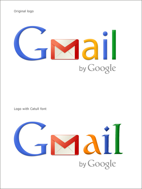
At the end when the final logo get passed it had “G” written in the original font of Google, i.e. “Catull”, followed by “M” depicted on an envelop and then “ail” written in a different font, i.e. “Myriad Pro”.
Gmail is a single word and using two different font in single word is a big design shift. But they opted to do so because, as Kevin Fox shared on Quora, “a” looks weird in the “Catull” font.
To test this claim I wrote Gmail in the Catull font and matched it with the actual logo. My observation echoes the voice of Kevin Fox.
Bold decisions have their own merits.
(Gmail is a registered trademark of Google Inc.)
By: Pankaj Bengani


