
Chhattisgarh, a small state carved out of Madhya Pradesh (India) is full of surprises indeed. It is land full of flora and fiona. Yet the new print campaign of Chhattisgarh Tourism doesn’t do the justice to it.

There are at least five reasons why it did not appeal to me.
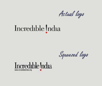
- Tempering an official logo
To me it is a design crime. You just can’t temper with the size, aspect ratio and colours of an official logo, isn’t it? Yet in this print campaign, i see, the logo of Tourism India has been squeezed from both the side.
- Boring photo
Just Google once and you would find a better alternative photograph of leopard. The photo used in this campaign is just too common and un-appealing. It has no visual charisma to attract the eyeballs.
- Too much text
By the time your eye sight reaches to the black box with some more text you get tired of reading. The whole creative is too congested and “texty”. There is no breathing space.
- Un-inspiring Brand positioning
Two logos associated with Chhattisgarh are being used at two different locations. I think there was no need to put a separate logo of Chhattisgarh at the bottom of the creative when the logo of state tourism is already there. It creates confusion.
- Dull colour scheme
And finally, i feel, the colour scheme for these campaign should have been little vibrant. After all Chhattisgarh is all about scenic beauty.
—–
BTW, one of the best tourism ad in recent times. //

Pankaj is CEO and Chief Visualiser of Chhavi. He loves film making & traveling and wasting time on Twitter 🙂 .
