
Those who uses the Twitter on the go may disagree (and they would have their own good reasons) but for the starters, Twitter is not an easy social network to interact with. Of course, when you sign up for the first time, Twitter does recommend some good handles to follow based on the categories you like most. But even then one may not find it too helpful to keep the interest on.
So, the real action happens when a Twitter user gets good numbers of followers and he himself starts following a good set of people or services who update their status more often.
In any case for the starters, Twitter is more like “Okay, am here. Now what?”. And, it is just opposite to the golden rule put forwarded by ace usability consultant Steve Krug – “Don’t Make Me Think”.
When it comes to web interfaces, one of the core good user experience aspect is to grab the interest of user “above the fold” – that he should find the content interesting enough to stay and scroll to look for more. And best, if he finds it interesting enough to sign up.
Twitter has changed its home screen recently for good. Now when you browse Twitter.com (with signed off state) you would see interesting semi curated tweets of the people and services bifurcated in several categories, depending upon the country you are browsing from. So in India we see “Bollywood” but for the USA there is “Superball”.
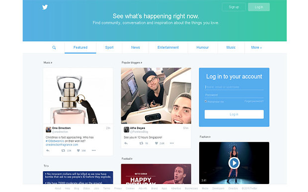
Now the home screen of Twitter is tempting. It actually encourages users to go through interesting tweets even before signing in to the service. In the blog post Twitter announced it – “a big change for the many millions of people who visit every month who don’t log in, but still want to know what’s happening.”
Twitter did it right. A bit little late but than better late then never.

Pankaj is CEO and Chief Visualiser of Chhavi. He loves film making & traveling and wasting time on Twitter 🙂 .

