
I always had keen interest in analyzing & learn from the digital campaigns of President Hopefuls of America. These campaigns are well conceptualized, choreographed and implemented and if you have a flare in UX and UI designs, these websites give you an ample scope to study and learn.
This year there are 4 candidates for presidency so far, out of which 3 have their website ready.
Here is my first “to start with” review of website homepage of president hopefuls.
Hillary Rodham Clinton

The most known face among the all is Hillary Clinton and hence she enjoys the early advantage. But then she enjoyed the same advantage on 2007 as well. At that time, she was poised to win the nomination from democrats but lost to Obama in a surprisingly long, interesting and very expensive battle.
This time, however, she is far more aggressive with her campaign. As per NY Times, Ms. Clinton has built the largest campaign operation of any potential candidate so far, with Robby Mook, a veteran of her 2008 campaign, the leading contender for campaign manager.
CAMPAIGN VIDEO
Awesome. Campaign video of Hillary is perhaps the most effective element of her website. What works well with this video is its simplicity and a strong message that connects with the people. In this video Hillary, very successfully, integrates their dreams with her. This is one of the most beautifully filmed campaign video, and am sure a lot of thinking has been put on table before shooting the first frame.
KEY MESSAGE & SLOGAN
Every 4 year, every president hopeful comes out with a catchy slogan, quote or a key message. Hillary in her turn came up with a “Champion” quote. “Every Americans need a champion, I want to be that champion.”The message is clear. With this Hillary has positioned herself as a clear leader who can take the country forward.
UX
The campaign website of Hillary Clinton is simple, clean & connects Well. It loads fast on desktop and mobile and surprisingly has “material” design transition effects too.
![]() The logo of Hillary Clinton’s campaign is getting criticized on social networks. Some resembled it with twin towers and the tragedy of 9/11, while some said it is a direct copy of FedEx. Wikileaks too jumped the wagon and accused that Hillary has stolen the concept from their logo.
The logo of Hillary Clinton’s campaign is getting criticized on social networks. Some resembled it with twin towers and the tragedy of 9/11, while some said it is a direct copy of FedEx. Wikileaks too jumped the wagon and accused that Hillary has stolen the concept from their logo.
Hillary Clinton has stolen our innovative WikiLeaks twitter logo design. Compare: @WikiLeaks vs @HillaryClinton pic.twitter.com/mifka4mXf4
— WikiLeaks (@wikileaks) April 12, 2015
I do believe, this logo is amateur in design but what works well with this logo is its usability quotient. The right pointed arrow helps in designing the key UI elements and it has a lot of potential to get recognized easily and help in communication as well.

What I like most in this website is its minimal approach towards text and graphics. Not only the website loads fast, but you can actually go through the entire home page in less than 60 seconds, and would not miss anything that is important to you.
UI
The above the fold screen of this website shows a beautiful photograph of Hillary talking to the common people. The charming smiley face gives a soothing feel. Very thoughtfully the wardrobe of Hillary is being chosen to dark blue, one of the color of her logo (it is also the color of democrats). And, if you look at the header image closely, the red buttons and overall blue hue gels well with each other.
The layout is simple with subtle CSS3 markup.
Social values play a key role among US electorates. Some guys post photos with their wives, some with family and some even with their pets. Hillary chose to show a photograph of her school days (everybody knows Bill Clinton anyway… ahem). But do look at the photo, Only Hillary is looking confident among all those pretty girls. Message is loud and clear.
Rand Paul
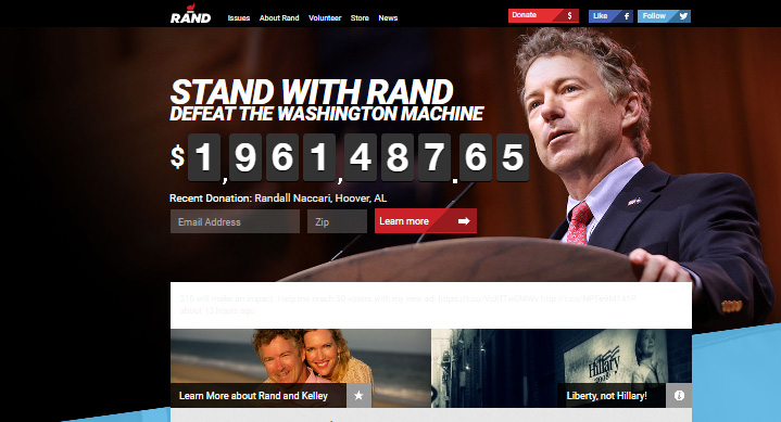
Rand Paul is republican president hopeful, and unlike Hillary he faces a stiff challenges from his colleagues to win the nomination.
As per NY Times, he has hired Chip Englander, who managed Bruce Rauner’s successful campaign for governor of Illinois, as his campaign manager.
KEY MESSAGE & SLOGAN
“Defeat the Washington Machine”, with this Paul wants to end the monopoly of Washington. “The Washington machine that gobbles up our freedoms and invades every nook and cranny of our lives must be stopped!” he said. This works best with the conservatives, and he knows.
UX
Open the Rand Paul’s campaign website and a popup will welcome you with a appeal to make donation. Not just that, it also features everything that has been tried over a million time before to attract (and force) user to click. If you do not want to make a donation you can click on “No thanks, take me to the website.”
So I have two options, make a donation or say thanks but no thanks.
At first glance, Rand Paul’s website (especially the above the fold part) looks like a website of motivation speaker. This layout is old school now – used and repeated “N” number of times.
Scroll down to see the key information related to Rand’ campaign, videos, volunteer information and more. Everything that matters and important is available on the homepage.
Team Rand has strategically put “Rand on issues” module in between the other modules. It is perhaps the most vital module and the white background makes it recognized easily.
UI
Rand’s website is cluttered and has usability issues. While top part of the website is congested the lower part has lot of empty space. There are too many colors used on the main page and background contains images and flashy colors, which makes hard to concentrate on visuals and key elements.
Frankly, except for the cover-shot image of the Rand I did not like the layout, module placement and text arrangement.
Marco Rubio
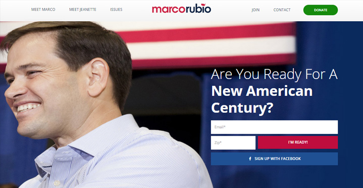
Republican senator Marco Rubio has announced his candidacy with a call to donors. He has also hired Jim Merrill, who previously ran Mitt Romney’s primary campaigns in New Hampshire.
KEY MESSAGE & SLOGAN
“Are You Ready For A New American Century?” – It is something similar to the the famous “Change” slogan of Obama.
UX
Marco Rubio’s website reflects the policies of Republicans. Scroll down the website and you would find all the “hardline” issues and stand – be it “Protect the second amendment” or “Stand with Israel”. And, there are a good chunk of people who would support these ideas, so team Marco has successfully communicated the issues, visions and ideas on the home page.
The cover image is good but the placement of signup form is odd, as Marco is looking in the opposit direction. So there is no connect between the two and eye movements get distracted.
Layout of the website, however, is simple and easy to understand. Everything is divided into several modules so it is easy to pick what one want to see and explore further. Interestingly, Marco has not put any photograph of family or his wife, which is common among the other president hopefuls’ websites.
UI
Expect of Hillary Clinton, both of republican hopefuls have used their name as logo. To add the pep, team Marco has used map of United States as a replace of dot in “i”.

There are some beautifully designed modules, like “Fight Communism” and “A Can-do Attitude” but there are equally bad designed modules like “Iran” and “Real Reform…” too. Overall there is no consistency in font and design.
Looking at these 3 websites, Hillary Clinton’s website wins the race. But the list will grow further as other senators and governors would announce their candidacy. So I shall update the post when it happens.

Pankaj is CEO and Chief Visualiser of Chhavi. He loves film making & traveling and wasting time on Twitter 🙂 .